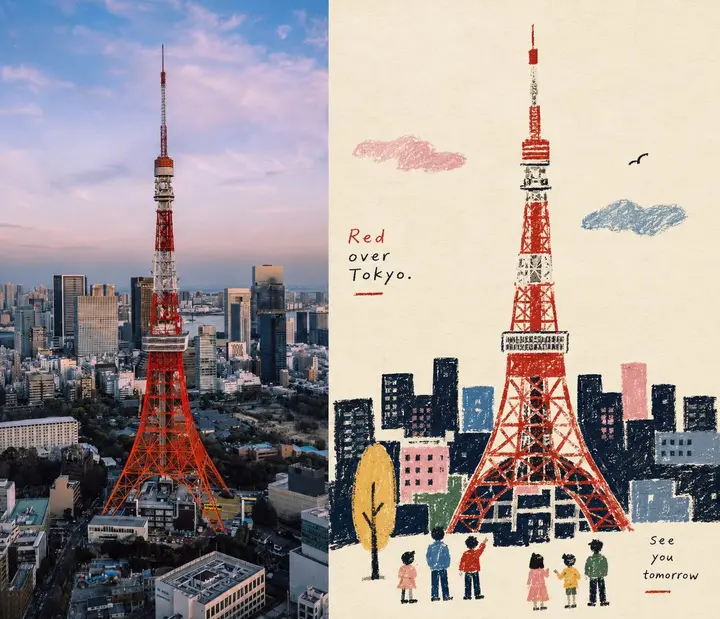
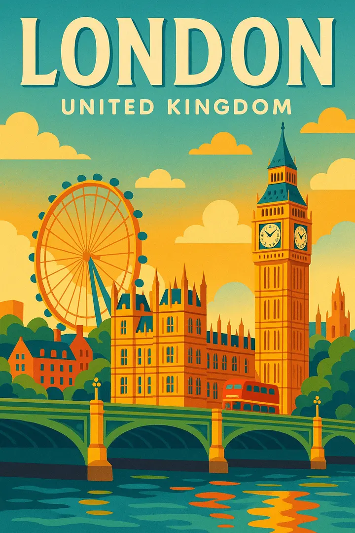
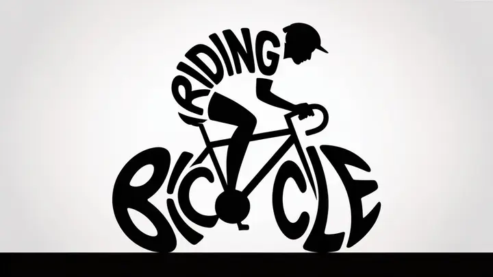
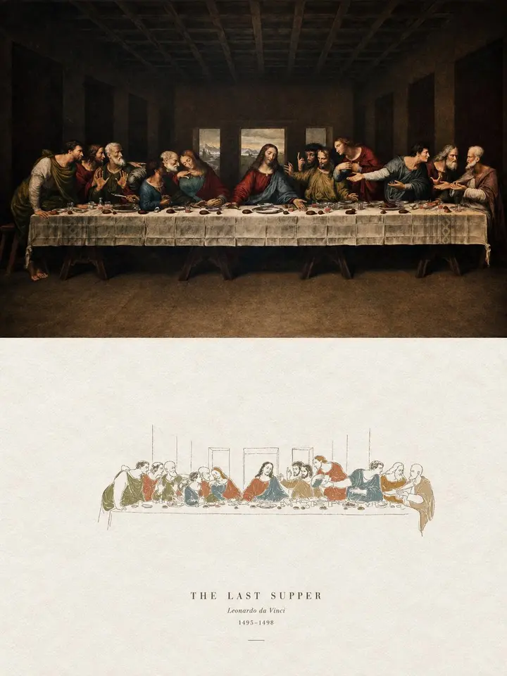
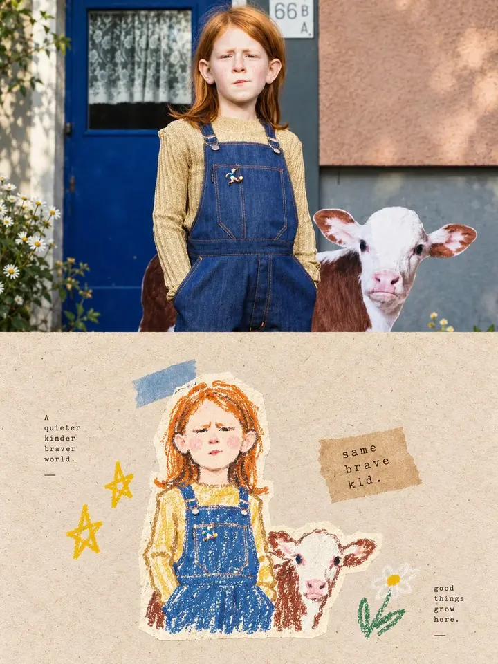
Use a 3:4 vertical layout split into top and bottom halves of exactly equal height (50% each).

Top half: keep the original photo, preserving the subject's identity, structure, pose, real texture, natural light and original color mood, with only a light, refined grade for an art-magazine, indie-publication and exhibition-image feel. Extend the surroundings naturally to fit the frame, but never stretch, distort or alter the subject.

Bottom half: extract the photo's most recognizable **subject, outline, pose and narrative relationships** and rebuild them as a **naive folk-inspired narrative illustration**, a textured flat storytelling illustration with a naive folk-art feel. Don't trace the whole photo; deliberately remove details and retell the scene with silhouettes, primitive shapes, a few color blocks and icon-like elements, keeping only the visual cues that preserve the subject's identity and story.

Shapes are built from **simplified silhouettes and large primitive forms**. Use the grainy texture of **crayon, oil pastel, thick pencil and other dry media**. Black or dark areas keep marks of wiping, rubbing, layering, breaks and paper showing through; outlines have slight handmade errors and clumsiness. The palette is a simple, bright limited color palette: warm white paper and dark silhouettes as the base, with a few spot-color accents of blue, red, yellow, green, pink and orange.

Overall, the look comes from naive silhouettes, flat space, crayon grain, a limited palette, folk-art symbols and editorial storytelling. Side-by-side layout, ratio 7:6.