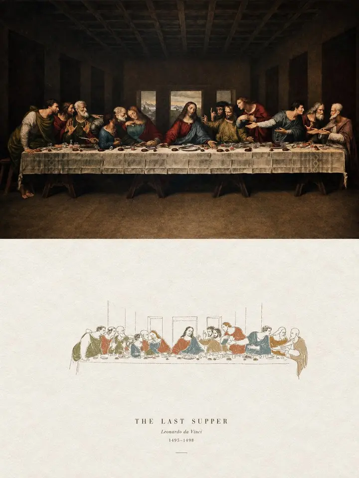
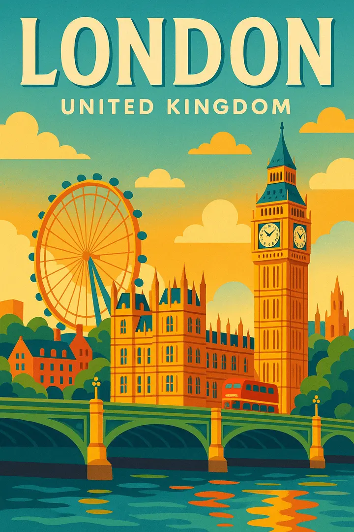
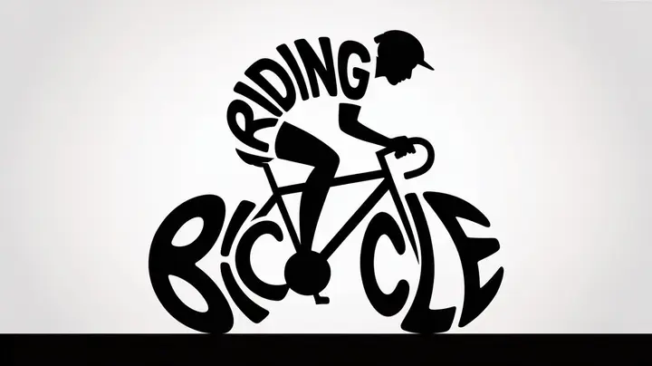
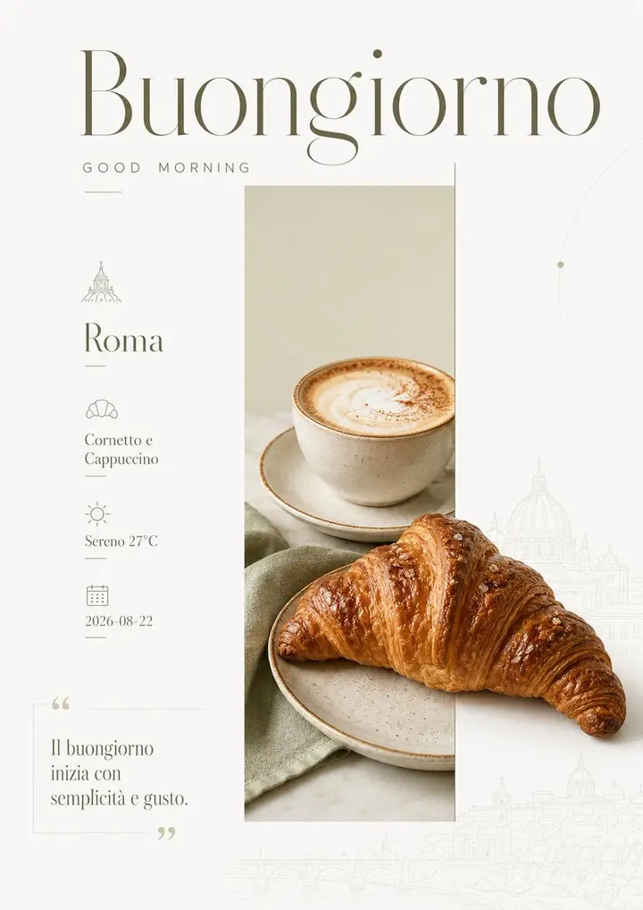
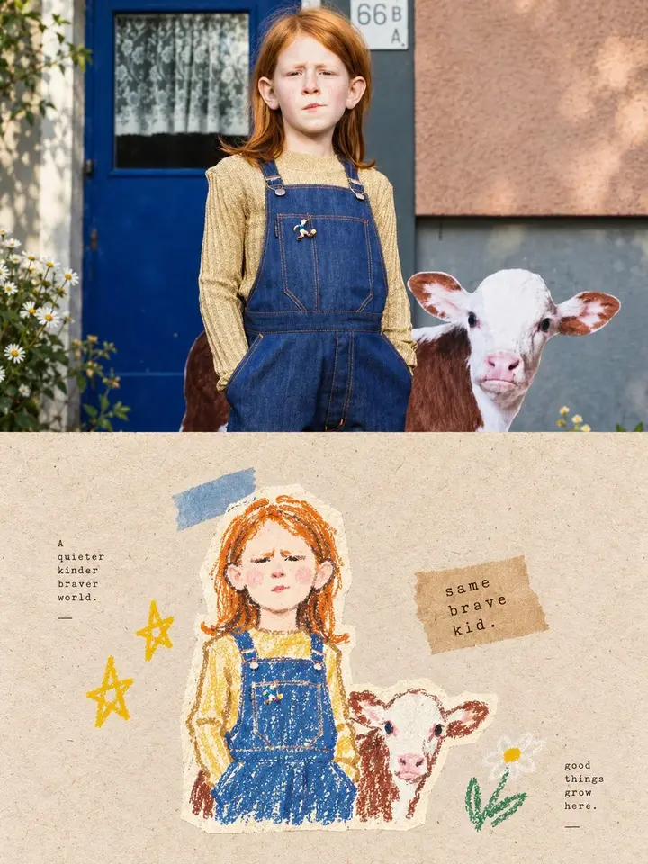
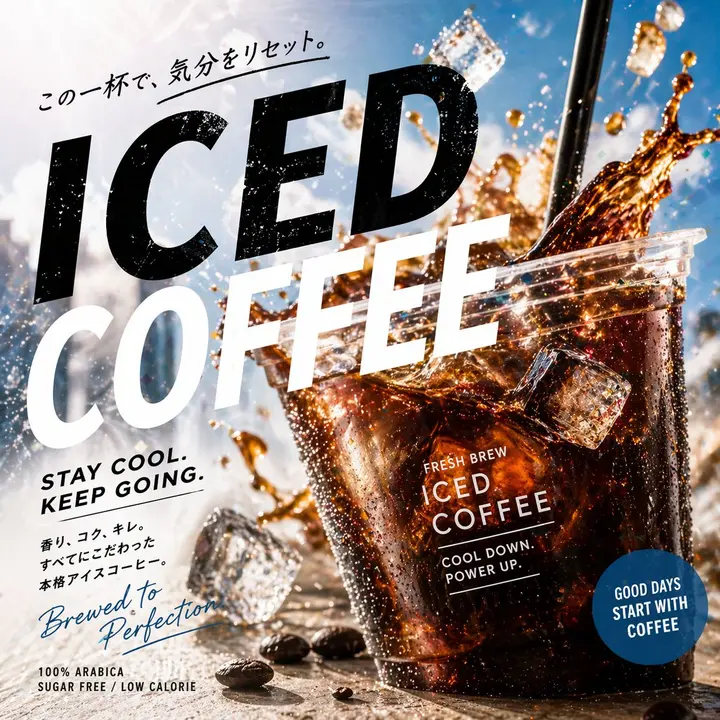
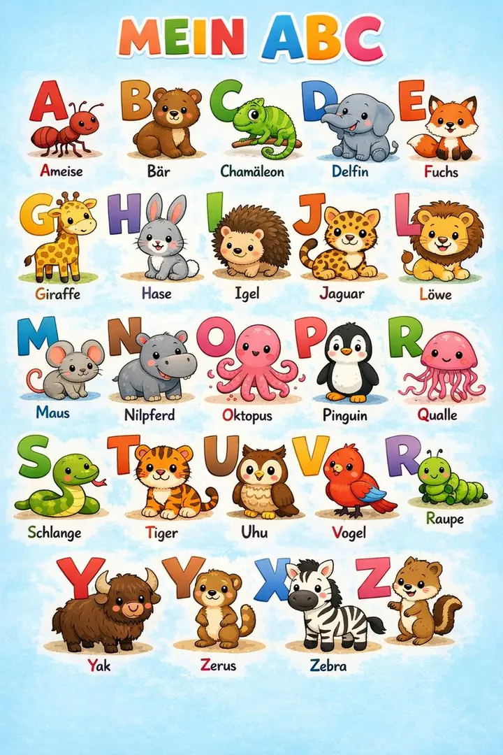
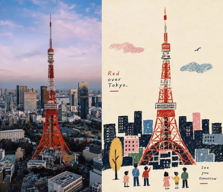
Turn each uploaded photo into its own premium design poster; no collages, one output per photo. Use a 3:4 vertical layout split into top and bottom halves of exactly equal height (50% each).

Top half: keep the original photo, preserving the subject's structure, real texture, natural light and original color mood, with only a light, refined photographic grade for a magazine and art-book feel. Extend the sky, ground or surroundings naturally to fit the frame, but never stretch, distort or alter the subject.

Bottom half: extract the photo's most recognizable subject, outline, pose and narrative relationships and rebuild them as a minimal, paper-textured hand-painted cover illustration. Strongly distill and remove complex details, keeping only the key visual traits, expressed with thin, slightly unsteady hand-drawn lines and a few clear flat acrylic color blocks, so the original theme is recognizable at a glance. Keep the subject small and focused, about 10–20% of the bottom half, surrounded by wide white space. The background is mostly rough white or pale paper, with only a few lines or color planes hinting at the setting.

Color: take the palette from the photo above and reduce it to no more than 4 main colors; bold, solid, restrained color blocks, keeping paper grain, hand-applied strokes and slightly irregular edges. Lines suggest structure; color blocks build the subject. Avoid colored pencil, crayon, watercolor bleeds, pure line art, complex realism, heavy oil paint, glossy digital illustration and 3D looks.

A little simple text may be added — a title, theme word, object name, place, year, number or short phrase, chosen to fit the photo, not limited to city themes. Typography is airy and restrained, blending with the white space and illustration, with the feel of an art-book cover, indie publication or children's picture book. Overall: small subject, large white space, strong distillation, high recognizability; quiet, playful, relaxed, poetic and refined. Avoid commercial cartoon, e-commerce and template looks.