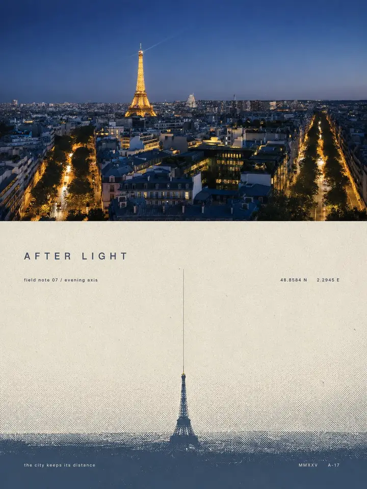
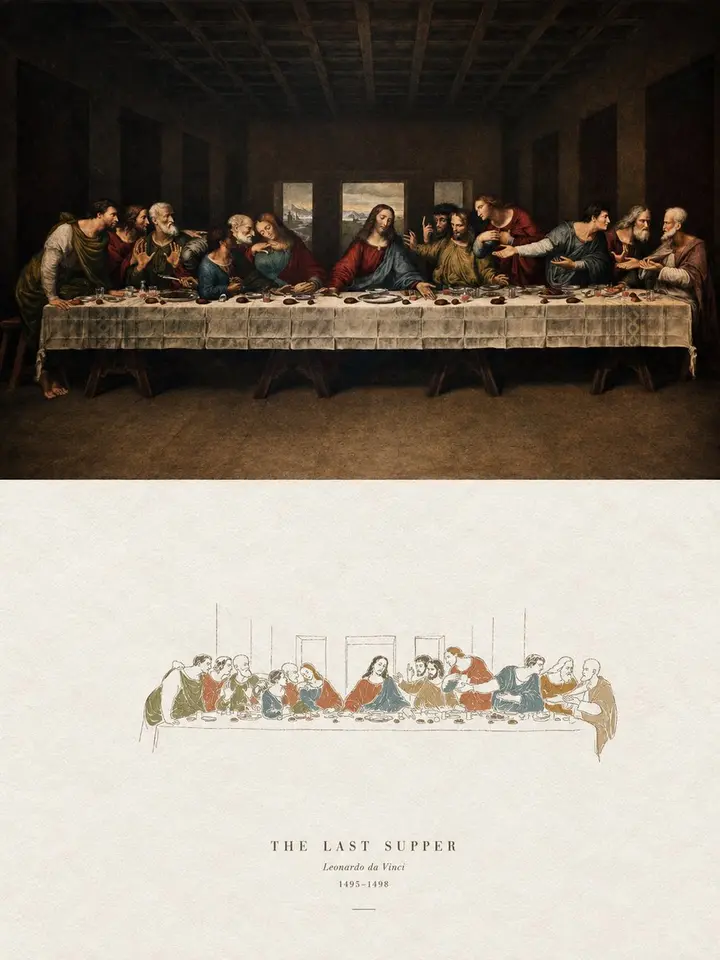
Turn each photo I upload into its own separate premium design poster; no collage, one output per photo. 3:4 vertical layout, top and bottom sections at an exact 1:1 height ratio, each 50%.

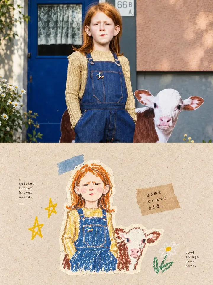
The top half keeps the original photo, preserving subject structure, texture, natural light and color mood, with only a light refined grade for an art-magazine, exhibition-photo feel. Sky, ground or background may be extended naturally to fit, but never stretch, distort or alter the subject.

The bottom half extracts the photo's most recognizable **subject, outline, pose and narrative relationships**, compresses them into one visual anchor, and rebuilds it as a minimal screen-print and halftone poster. No tracing or rich detail: keep one key shape, action or spatial relationship, recognizable at a glance.

Composition: **one subject, one direction, one spatial relationship**. The subject is usually small, with large empty space for distance and poetry. Choose one structure: horizontal spread, vertical extension, isolated suspension, dispersing outward or receding into depth. A horizon, edge, shadow or halftone band can build space; emptiness is the main element.

Color: distill the photo's temperature, value and mood into a limited spot-color set of **paper tone + main ink + haze tone**: off-white, warm gray or natural paper for empty space, one calm heavy main ink, and a lighter grayer tone of the same family for air and depth. 2-3 colors total; tiny accents only when meaningful.

All haze, distance, shadow and transitions use **halftone dots fading from dense to sparse**, no digital blur or gradients. Keep paper grain, screen ink, slight misregistration and uneven inking, like an art print on old paper.

**Keep a small, refined editorial text system.** Generate a very short English title from the theme, mood, time, action or metaphor, plus tiny subtext, numbers, years, chapter marks, coordinates, archive marks or one understated English line, slightly abstract and curatorial (distance, stillness, passing, echo, boundary, time, light, trace).

Text joins the composition: run small text along the horizon, hug the subject, form a vertical axis, cross halftone edges or hide in negative space, with hairlines, short dashes and page-number marks. Words may be split, set vertically or partly covered, but stay readable. One short title plus 1-3 tiny groups; restrained sans, gentle serif or narrow type with extreme size contrast, wide tracking and thin weights, in the main or haze ink with slight misregistration.

Overall: very few elements, vast empty space, a tiny subject, strong order and subtle text; quiet, lonely, vast, poetic, collectible. Avoid busy layouts, multiple focal points, big headlines, ad copy, plain gradients, cheap retro filters and template looks.