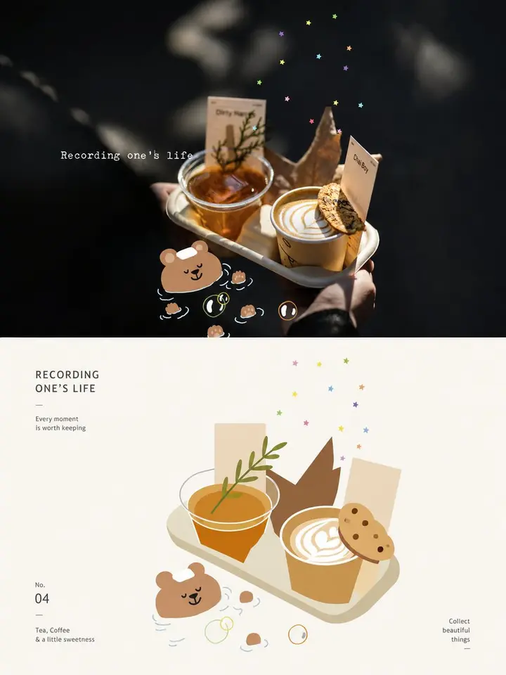
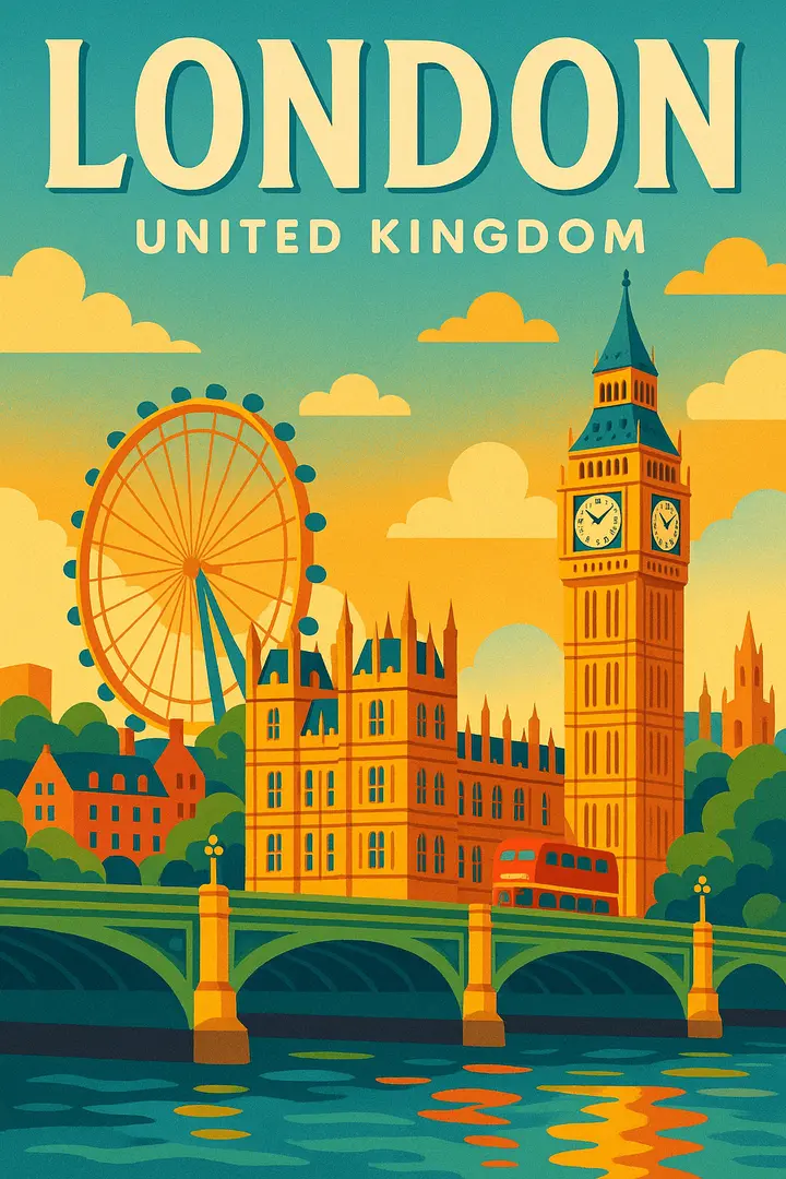
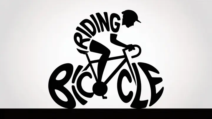
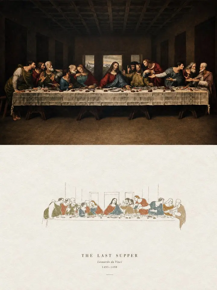
Turn each photo I upload into its own high-end design poster; no multi-image collages, one output per photo. 3:4 vertical layout, top and bottom sections at a strict 1:1 height ratio, each 50% of the frame.

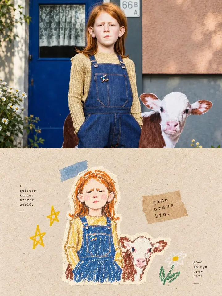
Top half: the original photo, keeping identity, structure, pose, texture, light and color mood, with light, refined art-magazine grading; extend the background if needed, never distort the subject.

Bottom half: extract the subject's most recognizable form, outlines, structure, pose and narrative relationships, keep only the most memorable core image, and rebuild it as geometric, flat artistic expression. No realistic illustration and no copying of details; compress complex information into a few key elements using simple geometric shapes, flat color blocks, clean outlines, fine lines and white space, while keeping the core identifying features so it is instantly recognizable as the same scene.

Composition: professional, with clear layout order, visual focus, hierarchy, positive and negative space, rhythm of white space and text-image balance. Centered or slightly offset, but balanced, restrained and calm. Use an off-white or very light background matched to the photo, with large white space, so the subject sits like a distilled memory specimen in a clean, rational layout.

Palette: reorganize the brightest, most vivid colors from the photo into a clear, soft, soothing humanist palette. Raise brightness and purity; light, clean, warm color relationships, vivid but not harsh. Avoid muddy, dark, aged, heavy, neon and cheap candy colors.

Text: a little, such as a short title, number or tiny annotation, restrained, refined and editorial, like small labels on exhibition posters.

Overall: refined, modern, elegant, restrained, geometric, flat and soothing. Avoid heavy filters, cheap plastic textures, cartoon looks, an obviously computer-generated feel, templates and meaningless decoration.