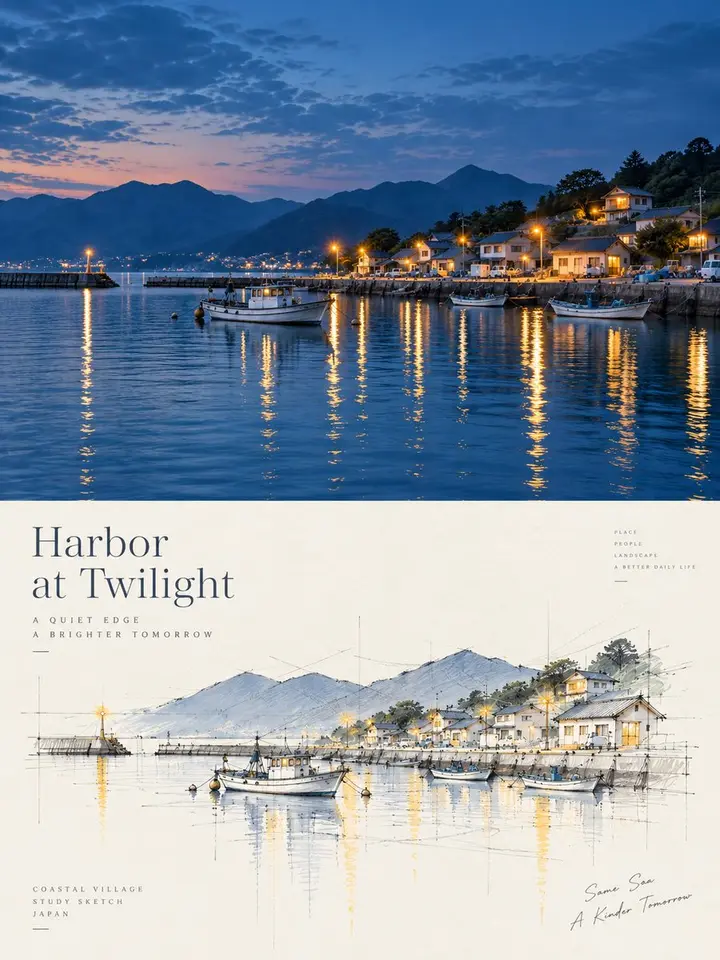
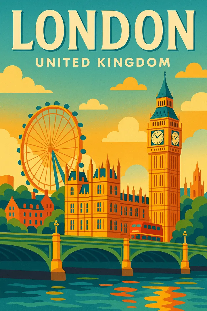
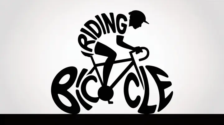
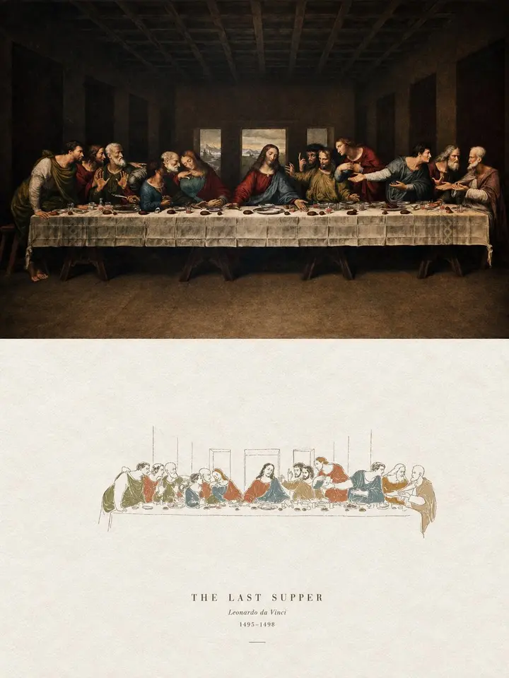
Turn each photo I upload into its own high-end design poster; no multi-image collages, one output per photo. 3:4 vertical layout, top and bottom sections at a strict 1:1 height ratio, each 50% of the frame.

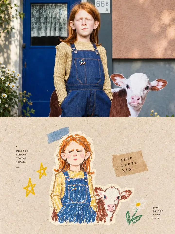
Top half: the original photo, keeping identity, structure, pose, texture, light and color mood, with light, refined art-magazine grading; extend the background if needed, never distort the subject.

Bottom half: extract only the most recognizable subject, outlines, structure, pose and narrative relationships and rebuild them as an architectural concept perspective sketch. Do not reproduce the full scene or copy objects one by one; remove most background and irrelevant detail, keeping only core forms, spatial relationships and memorable points. Make fresh artistic decisions: even if the original is poorly composed, cluttered or small, rescue it through cutting, regrouping, cropping, scale shifts and white space.

Style: freehand perspective line work plus a few selective color blocks. Loose, restrained lines with some repetition and pauses; keep a few guide lines, extension lines, construction lines and geometric reference lines. Color only a few key areas to stress the subject, structure or shadows.

Generous, deliberate white space is essential: a smaller, refined subject that may sit off-center, touch an edge or be cropped. Draw less rather than fill. A few geometric shadow blocks may add depth. Keep the background minimal.

Palette: take 2-4 of the most distinctive colors from the photo and refine them into a clean, restrained sketch palette: off-white, light gray, warm gray, soft green, pale wood, light blue-gray, with a few brighter accents. Avoid muddy, dark, overly retro or cheap saturated tones.

Text: only minimal editorial touches, any language; a few words or notes based on subject, place, action or mood, placed quietly in the white space.

Avoid full scenes, full coloring, photoreal renders, heavy outlines, cartoon, 3D and templates.